Picking the Right Color Palette for Web Design
Discover the art of selecting the perfect color palette for your web design, creating a captivating user experience.
Sep · 2023


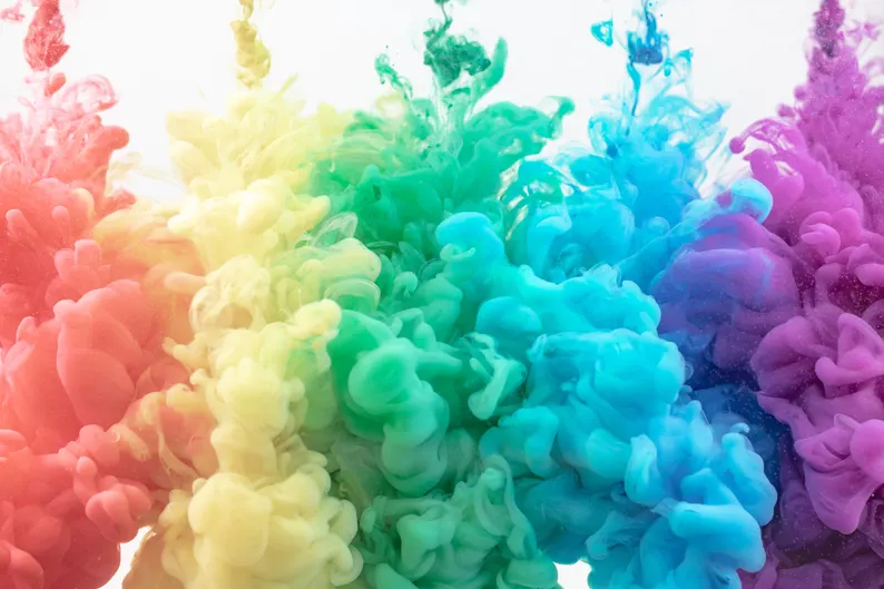
Photo by Hamed Daram on Unsplash
When it comes to web design, one of the most crucial decisions you’ll make is choosing the right color palette. Colors play a significant role in shaping the user experience and conveying your brand’s message. In this article, we’ll explore the importance of selecting the right color palette and provide some tips to help you make the best choices.
Understanding Color Psychology
Color psychology is the study of how different colors can evoke emotions and influence behavior. It’s essential to consider the emotions you want to evoke in your website visitors when choosing a color palette. Here are some common color associations:
- Red: Represents energy, passion, and urgency.
- Blue: Conveys trust, calmness, and professionalism.
- Green: Symbolizes growth, health, and nature.
- Yellow: Evokes optimism, warmth, and creativity.
- Black: Suggests sophistication, luxury, and formality.
- White: Represents purity, simplicity, and cleanliness.

Creating a Harmonious Palette
Harmony is crucial in web design. Your color palette should consist of colors that work well together. One common approach is to use a color wheel to find complementary or analogous colors. Tools like Adobe Color Wheel can help you explore different color combinations.
Considering Accessibility
Accessibility is an essential aspect of web design. Ensure that your chosen color palette is accessible to all users, including those with visual impairments. Use sufficient contrast between text and background colors and follow the Web Content Accessibility Guidelines (WCAG).
Testing and Feedback
Before finalizing your color palette, test it on various devices and browsers to ensure consistency. Additionally, gather feedback from users and colleagues to see how they perceive your color choices.


Examples of Effective Color Palettes
Here are a few examples of websites with effective color palettes:
- Apple: Known for its clean and minimalist design, Apple’s website uses a simple palette of whites, blacks, and grays with occasional pops of color to draw attention to key elements.
- Spotify: Spotify’s palette combines bold greens with contrasting whites and blacks. This combination emphasizes its brand while providing an intuitive user interface.
- Etsy: Etsy’s website uses warm and inviting colors like orange and teal to create a sense of community and creativity. These colors reflect the handmade and unique nature of the products on the platform.
Conclusion
Your website’s color palette is a powerful tool for conveying your brand’s identity and influencing user behavior. By understanding color psychology, creating a harmonious palette, considering accessibility, and seeking feedback, you can pick the right colors to create a visually appealing and effective web design.
Add your first comment to this post
You must be logged in to post a comment.